

Slate Flexible Stone Veneer Manufacturer Reveals How to Choose the Perfect Finish for Modern Facades
2026-09-09
Choosing a facade finish can make or break a modern building’s character. With slate flexible stone veneer, the possibilities go far beyond a single gray slab—yet most designers still default to the same tired look. Magic Stone has spent years refining finishes that balance texture, tone, and weather resistance. In this post, the manufacturer shares the overlooked details that separate a flat, artificial appearance from a facade that feels genuinely alive.
Why Finish Choice Matters More Than You Think on a Modern Facade
A facade's finish does far more than wrap the structure in color. It shifts how shadows settle across the surface, how rain streaks or sheets, and how the building reads from a block away versus up close. On a modern facade with large, uninterrupted planes, a smooth high-gloss coating can turn a simple volume into something almost liquid under overcast skies, while a matte, finely grained render tends to absorb light and make the same geometry feel heavier, more grounded. The choice quietly steers perception before anyone notices the window pattern or the roof line.
There is also the wear factor that renders and paints can hide or expose. A finish with subtle tonal variation will forgive dust, minor cracking, and uneven curing in ways that a flat, uniform field cannot. In coastal or high-UV environments, certain pigments and binder systems fade unevenly, leaving large facades looking patchy within a few seasons. Choosing a finish that ages visibly but gracefully — think mineral washes, textured stucco, or anodized metal with a slight directional grain — keeps the building from demanding constant recoating and preserves the crispness of the original design intent.
Context matters just as much as the material itself. A dark, reflective panel might feel sharp against a blue-glass office district, but the same finish can turn a low-rise courtyard into a glaring heat sink. The best modern facades use finish not as a final cosmetic layer but as a way to tie the building to its climate, its neighbors, and the daily path of the sun. That is why a decision that seems small on a sample board ends up shaping how the entire building is remembered.
Breaking Down Slate Veneer Surface Options Without the Jargon
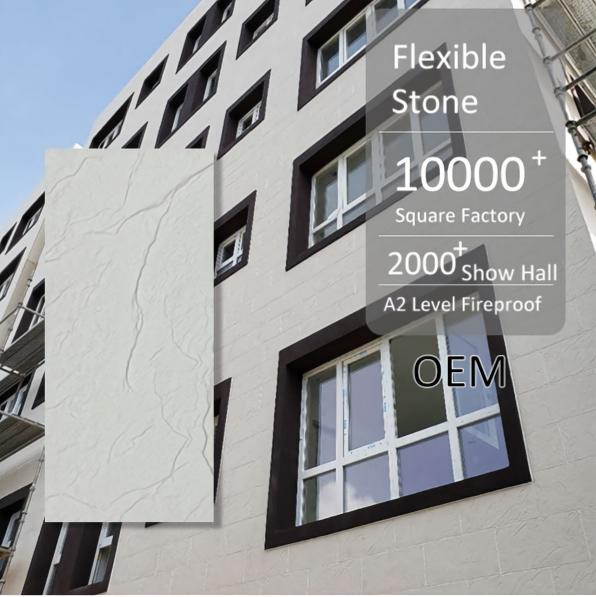
Slate veneer comes in a few distinct surface treatments, and each one changes how the stone looks in place. A naturally split surface keeps the rough, uneven texture from when the slate was quarried. It has a rugged, outdoor feel and does a great job hiding everyday wear, though those ridges can collect dust.
If you prefer a calmer look, a honed finish is ground smooth but left without shine. The surface feels flat and even, with a soft matte appearance that works especially well in kitchens or bathrooms where you want stone character without a heavy, rustic vibe.
For something with more depth, a polished finish is buffed to a low gloss, which makes the slate's color variations stand out. The tradeoff is that it shows smudges and water spots more easily. Somewhere in the middle sits a brushed or leathered texture—it rounds off the sharpest edges of the natural split while keeping a tactile, lived-in feel.
Matching Texture and Sheen to Architectural Styles That Actually Last
Texture and sheen do more than catch the light; they anchor a building to its era and intent. A smooth, polished surface can sharpen a minimalist facade, while a rough, matte finish lends weight to rustic or industrial forms. The key is not chasing trends but reading what the architecture already asks for. For a mid-century modern home, low-gloss wood and honed stone keep the lines crisp without stealing attention. For a classical revival, a soft eggshell on plaster lets ornamental depth emerge without glare. These pairings feel inevitable because they respect the material's own voice and the style's visual logic.
Longevity comes from restraint. A high-gloss lacquer on ornamental molding might dazzle for a season, but it can flatten the very shadows that give detail its character. Instead, match the finish to the surface's role: semi-gloss on trim where a slight reflectivity helps define edges, flat on large walls where imperfections and warmth should dominate. When texture and sheen align with the architectural language, the result isn't just a well-finished room. It's a space that holds up over time because every choice reinforces the structure rather than fighting it.
Regional materials often carry their own answer. Limewash with its chalky, uneven sheen belongs to Mediterranean and farmhouse forms, while burnished concrete suits brutalist and contemporary work. The durability isn't only physical; it's aesthetic. A finish that echoes the building's origins won't look dated in a decade because it never leaned on novelty. It simply makes the architecture more itself, and that kind of coherence is what actually lasts.
How Climate and Sun Exposure Quietly Dictate the Right Finish
A finish that looks flawless in a coastal town might start peeling within a year in the mountains. Humidity, temperature swings, and rainfall patterns all pull at coatings in different ways, so matching the product to the local climate isn't just a best practice—it's the difference between a surface that survives and one that needs constant repair.
Sun exposure is equally ruthless. Ultraviolet light doesn't just fade pigments; it breaks down the molecular bonds in oils, varnishes, and even some modern polyurethanes. South-facing walls or decks with no shade can eat through a standard exterior finish in half the expected lifespan, forcing you toward higher solids content or UV-stabilized formulas.
In practice, a dry, high-altitude region calls for a more elastic finish that can handle rapid temperature changes without cracking, while a humid subtropical zone needs something with strong mildew resistance and better water repellency. Ignore these quiet demands and you'll be stripping and recoating far sooner than any warranty suggests.
The Underrated Role of Edge Profiles and Installation Details
Most people pick a countertop slab for its color and veining, then completely ignore what happens at the edges. That's a mistake, because the edge profile is the part you actually touch every day. A sharp 90-degree corner looks crisp in photos but chips easily and feels unforgiving against forearms when you lean over to wipe the counter. A simple eased edge takes off just enough material to reduce chipping without calling attention to itself, while a full bullnose hides small imperfections in the fabrication and works well in busy kitchens where kids or pots are constantly bumping the perimeter.
Installation details get even less attention, but they quietly determine how long a countertop lasts and how it ages. Seam placement, for example, should be planned around sink cutouts and cooktops to avoid weak bridges of stone—not left to the installer's guess on site. Overhang support matters too: a 12-inch breakfast bar overhang without steel brackets or corbels will eventually sag or crack, even if the slab itself is thick. And if the installers don't shim the cabinets level before setting the stone, you'll see the uneven gaps at the backsplash line within a week, no matter how pretty the quartz is.
What makes these choices underrated is that they don't show up in a showroom photo. You can't swipe to see a close-up of a dishwasher panel reveal or a properly notched corner where the profile transitions from eased to ogee. But once you've lived with a countertop that has a thoughtful edge and clean, structural install details, going back to a rushed fabrication feels like sleeping on a mattress with no edge support. The slab itself is just the starting point—the profile and the way it's set are what turn a material sample into a surface you can actually live on.
What Manufacturers Won’t Always Tell You About Maintenance and Touch-Ups
Here’s a detail most brands won’t put in the owner’s manual: the touch-up paint they sell isn’t the same chemical formula as the original finish. Factory paint is applied in controlled booths and cured at high temperatures; the little brush-in bottle air-dries and often sits visibly proud of the surrounding clear coat. If your car lives outside, UV exposure and washing can make the original pigment shift over time, so even a bottle labeled with the exact factory code can look slightly off.
Another thing that gets buried: 'low-maintenance' or 'self-healing' clear coats still need careful handling. Aggressive polishing to remove a scratch can cut through the thin top layer and expose the color coat. And those touch-up pens? They’re convenient, but most leave a raised blob that catches light more than the original chip did. A detailer with a fine brush and wet-sanding technique often gets closer to the factory look than a do-it-yourself pen ever will.
Don’t assume a dealer’s body shop is using factory paint just because it carries the brand’s name. Many outsource to local suppliers and mix basecoat to match, which can be fine or can fade at a different rate. The real secret to fewer touch-ups is less exciting: rinse road salt off weekly in winter, use a pH-neutral wash, and skip the automatic brush tunnel. No touch-up product, no matter what the label promises, turns back the clock on UV damage or abrasion permanently.
FAQ
Start with the building's surrounding light and sightlines. A heavily textured, rough finish can anchor a low-rise structure and create pronounced shadows in direct sun, while a smoother honed surface tends to read as more precise and works well on taller elevations where details blur at a distance.
Matte finishes hide micro-scratches, dust, and minor water streaking better, so they need less frequent washing. Polished finishes reflect more light and can make a facade feel more formal, but they show every fingerprint and drip, and they can produce glare that bothers neighbors or pedestrians.
Single flat tones often look synthetic and can make large walls feel lifeless. Natural stone veneer with subtle tonal shifts—like charcoal with faint rust streaks or warm grey with quartz flecks—adds depth without busyness. The key is choosing a palette where the variation is visible up close but blends into a cohesive hue from across the street.
Yes, the best manufacturers use real stone layers bonded to a flexible backing, so the surface is genuine slate or quartzite, not a printed image. What varies is how faithfully the natural fissures, clefts, and mineral veins are preserved. Ask for a sample panel rather than a small chip to judge how the pattern repeats across a large area.
North-facing walls receive soft, diffuse light with little direct sun, so a glossy finish will look flat and dull for most of the day. A slightly rougher or honed texture with minimal sheen catches ambient light better and prevents the facade from receding into shadow. Lighter tone mixes also help lift the wall visually.
Pay attention to edge treatment and joint lines. A finish with natural, slightly irregular edges and a tight, non-uniform joint pattern mimics hand-set masonry. Avoid overly uniform bevels or perfectly straight grooves, which signal mass production. Also, ensure the finish carries around corners without a visible seam or color break.
Textured, cleft finishes trap airborne dust and pollen, so they may need a soft brush or low-pressure rinse once or twice a year in dry climates. Smooth honed finishes shed debris more easily but reveal hard water spots and efflorescence. A penetrating sealer can reduce both issues, but it must be reapplied every few years depending on exposure.
Conclusion
Most people assume any slate veneer will look good on a modern facade until the sun hits it. The finish you pick shapes how shadows fall, how the surface reads from across the street, and whether the building feels warm or cold. A smooth honed face can sharpen a minimalist box, but it also exposes every fingerprint and installation mark. A split-face or riven texture hides minor wall irregularities and adds depth, though it may collect dust in dry climates. Manufacturers often present finishes as personal taste, but the smarter question is what the building's geometry and surrounding light actually demand. A long south-facing wall in Arizona behaves differently than a shaded courtyard in Seattle. Sun exposure and rainfall quietly rule which sheen, texture, and edge profile will stay looking intentional rather than weathering into an eyesore.
Edge profiles rarely get discussed until after the panels are up, yet they frame every corner and reveal line. A chipped or inconsistent edge can ruin the crispness that modern facades rely on. Installers should ask about corner pieces, butt-joint tolerances, and how the flexible stone meets window frames. Maintenance also changes with finish choice. Matte and textured surfaces forgive scuffs and small repairs better than polished or glossy ones, which show every patch. A good manufacturer will tell you which finishes can be touched up without visible seams and which are better left alone. Ask about sample boards in real daylight, not just showroom lighting. The perfect finish is not the most popular one; it is the one that holds up under your climate, your detailing, and your building's own angles.
Contact Us
Contact Person: Vito
Email: [email protected]
Tel/WhatsApp: 86 13088879266
Website: https://www.magicstonemcm.com