

Warning Heat Transfer Labels Factory: Ensuring Durable Safety Messaging for Industrial Products
2026-08-28
When safety warnings fade, peel, or become illegible, the risk on a factory floor stops being hypothetical. That’s where a specialized warning heat transfer labels factory comes in—combining abrasion resistance, chemical resilience, and high-temperature performance to keep critical messages intact on industrial equipment. At Victorygen heat transfer label, we focus on one thing: making sure your safety labeling outlasts the machinery it’s stuck to. Before we dive into materials, testing standards, and application know-how, consider what your current labels might be hiding.
What Really Causes Warning Labels to Fail in the Field
In real-world settings, warning labels often lose their punch not because people can't read them, but because the surrounding context quietly drains their urgency. A worker who has handled the same chemical drum for years sees the faded skull-and-crossbones as part of the furniture, not a fresh alarm. The brain's habituation mechanism kicks in: once a stimulus becomes predictable, it stops triggering the startle response that warnings depend on. Add to that the sheer clutter of competing signage, from exit signs to machine placards, and even a well-designed label can vanish into visual noise.
Another overlooked culprit is the gap between the label's static message and the dynamic nature of the task at hand. A warning that says "Do not operate without guard" sits on a machine while a maintenance worker, pressed by a production deadline, removes the guard for a quick fix. The label assumes a stable, rational user, but field conditions are messy: time pressure, fatigue, and social norms often override the label's authority. When supervisors routinely bypass the same warnings without consequence, the label's threat credibility crumbles, and it becomes a piece of compliance theater rather than a genuine safety cue.
Finally, many labels fail because they were written for a generic reader, not the actual person standing in front of them. A farmworker with limited literacy or a non-native speaker may decode the words but miss the intended risk magnitude. Meanwhile, a veteran operator might read "Caution: Hot Surface" and think, "I've touched hotter," dismissing the label as overblown. Without field testing under real cognitive load, labels rely on assumptions about comprehension that rarely survive contact with the shop floor.
Heat Transfer Materials That Endure Chemical Spills and Abrasion
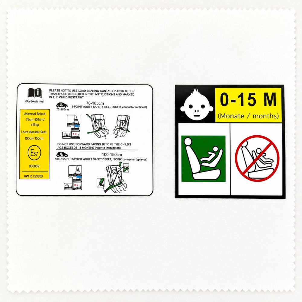
Industrial heat transfer films and labels get splashed with solvents, oils, and aggressive cleaners on a daily basis. Standard vinyl options often fail within weeks: printed layers peel, adhesives soften, and the graphic becomes unreadable. Cross-linked polyurethane and cast vinyl formulations resist this by creating a tighter molecular network that prevents chemical penetration and slows edge lifting.
Abrasion is a separate challenge. Films that survive a chemical wipe can still wear through from repeated rubbing against tool edges or packaging lines. Look for transfer materials with a hardened topcoat or embedded ceramic particles—these spread friction across the surface instead of letting it concentrate in one spot. The adhesive layer matters equally; heat-activated adhesives that cure into a closed-cell barrier stop chemicals from wicking underneath the film.
Verifying these claims takes more than a fingernail scratch. Solid suppliers publish Taber abrasion cycles, immersion test results in MEK or isopropyl alcohol, and thermal shock data. If a product only says "industrial strength" without specific chemical and abrasion ratings, assume it won’t hold up in a real lab or maintenance environment.
Designing High-Contrast Safety Warnings for Low-Light Conditions
Low-light environments push the eye toward its limits, so a warning that looks bold at noon can melt into gray by dusk. The trick is not simply cranking up brightness but controlling the relationship between luminance levels. A dark background with a highly reflective symbol or text creates a strong edge, but too much contrast can trigger halation and smear the message. Aim for a contrast ratio at the higher end of accessibility standards, yet balance it with thicker strokes and wider spacing to preserve legibility when the pupil dilates.
Material and finish matter as much as the printed color. Glossy surfaces scatter stray light and create hotspots that hide details, while matte or micro-textured coatings diffuse illumination more evenly. Using photoluminescent pigments or retroreflective sheeting adds a second layer of visibility when active lighting fails. Place warnings where workers naturally glance—near handrails, at floor transitions, on equipment edges—and avoid cluttering them with secondary text that competes for attention in the dark.
Testing under real-world conditions reveals what a screen mockup cannot. Dim the lights to the actual operating level, vary the angle of view, and simulate partial obstruction by dust or moisture. Ask people unfamiliar with the layout to spot the warning within a few seconds. If they hesitate, the design has failed regardless of its color-code compliance. Iterate with small changes: adjust the symbol size, switch from white to yellow-green, or add a thin border that separates the message from a busy background.
Pre-Production Testing to Simulate Years of Wear in Days
A robotic arm yanks a door handle through 100,000 open-close cycles while a climate chamber swings between -40°F and 160°F. By noon Thursday, the hinge shows the same fatigue microcracks that would normally take six years of daily use to appear.
Accelerated wear rigs don't just repeat motions; they stack stressors. Abrasive dust is injected into sliding surfaces, vibration tables shake loose fasteners, and UV lamps bake polymer housings until they chalk and crack. The resulting failure map tells designers which tolerances to tighten and which coatings to switch before the first production run.
The real payoff comes when a supplier changes resin or a plating thickness drifts. The pre-production torture test gives a baseline in days, not seasons, so the team can compare new samples against known weak points and ship with confidence that the product won't fall apart after two years on a shelf.
Custom Shapes and Sizes for Irregular Industrial Surfaces
Standard rolls and sheets rarely align with the reality of elbows, tees, flanges, valve bodies, and weld seams. Flat rectangles force operators to overlap, pleat, or trim on site, leaving weak points where moisture, chemicals, or heat can penetrate. Custom-cut pieces follow the exact profile of each component, so corners sit flush, bolt holes line up without stretching, and the material does not fight the underlying geometry.
Shops equipped with CNC drag-knife cutters, laser systems, and waterjet tables can process vector files directly from site measurements or 3D scans. This supports features like slits, notches, radiused inner corners, and asymmetric outlines that would be impossible to achieve cleanly by hand. Changes between prototype and production runs are handled at the file level, so there is no need to wait for a new die or reconfigure a press for many non-metallic materials.
Common applications include insulation blankets wrapped around irregular pump casings, gaskets that bridge uneven flange surfaces, wear liners for chutes with compound curves, and protective films for oddly shaped control panels. Because the blank is shaped before it reaches the floor, installation time drops and the consistency from part to part improves. This approach also reduces scrap, since waste is calculated in the nesting stage rather than left to the installer's knife.
Balancing Compliance Requirements with On-Brand Visuals
Striking the right balance between regulatory demands and a cohesive visual identity often feels like walking a tightrope. Legal teams push for disclaimers, standardized layouts, and clear risk warnings, while designers advocate for bold typography, immersive imagery, and a distinct color palette. The tension is real, but the two goals are not mutually exclusive. A compliance-first approach doesn't have to mean sterile, forgettable visuals—it simply asks for a smarter integration of mandatory elements into the overall design language.
One effective strategy is to treat compliance components as native design features rather than afterthoughts. For instance, required risk disclosures can be styled with the same font hierarchy and accent colors as the rest of the page, turning them into natural visual pauses instead of jarring interruptions. Similarly, standardized data tables or legal footnotes can be arranged with generous whitespace and subtle dividers that echo the brand's geometric patterns. The key is early collaboration: when designers and compliance officers align on a shared visual grammar from the outset, the final layout feels intentional rather than compromised.
Ultimately, balancing compliance with on-brand visuals strengthens customer trust. A brand that presents required information with the same care as its marketing messages signals transparency and reliability. Users may not consciously notice the seamless blend of legal text and brand aesthetics, but they do register the absence of friction. By treating compliance as an integral part of the visual story, companies can maintain regulatory integrity without sacrificing the personality that sets them apart.
FAQ
These labels are built for rough environments. We use industrial-grade adhesives and a protective top coat that resists abrasion, chemical splash, and UV exposure. Many of our customers run them on equipment that gets power-washed weekly without any lifting or fading.
For high-heat surfaces, we usually go with polyester or polyimide substrates paired with a heat-resistant adhesive. That combination holds up well past 150°C and won't bubble or peel when the machine cycles through temperature changes.
Yes, we can hit tight color tolerances using a calibrated digital printing process. If you have Pantone, RAL, or specific ANSI Z535 color references, send them over and we'll provide a physical proof before production.
We keep it flexible. For smaller projects or prototype builds, you can start with a few hundred labels. Large production runs get better per-unit pricing, but we don't force you into massive volumes if you're still testing a design.
The print layer is sealed under a clear protective laminate, so it's not exposed to direct contact. We also use scratch-resistant inks and run adhesion tests on every batch. If a label is going to see heavy abrasion, we can add an extra thick top coat.
Our production process aligns with common safety label standards like ANSI Z535 and ISO 3864. We can also supply material data sheets and durability test reports if your auditors need documentation.
Absolutely. We print everything from compact 2-inch machine labels up to large 24-inch safety decals for tanks and enclosures. The same heat transfer process works across that size range without losing edge definition.
After you sign off on the proof, most orders ship within 7 to 10 business days. If you're up against a shutdown or maintenance window, we can discuss a rush schedule and often cut that in half.
Conclusion
Industrial safety labels often fail long before the equipment they protect, and the root causes are rarely mysterious: solvent exposure, constant abrasion, UV degradation, and poor adhesion on textured surfaces. A heat transfer label factory tackles these issues by selecting polymer-based materials that resist chemical spills and stand up to daily wear without cracking or fading. For low-light environments, high-contrast inks and strategic use of reflective or bright base layers ensure warnings remain legible when visibility drops, so workers can read critical instructions at a glance.
Before any label reaches the production floor, pre-production testing compresses years of abuse into a few days through accelerated weathering, chemical immersion, and abrasion cycles. The factory also produces custom die-cut shapes and sizes that conform to curved housings, control panels, and irregular machine parts with no peeling edges. Throughout this process, the design team balances strict regulatory requirements—like ANSI or ISO formats—with brand-specific colors and typography, proving that compliance and visual identity do not have to conflict. The result is durable safety messaging that stays intact and readable for the life of the industrial product.
Contact Us
Contact Person: Wang Song Lin
Email: [email protected]
Tel/WhatsApp: +8613751282193
Website: https://www.heat-transferprinting.com/